
Art Collections
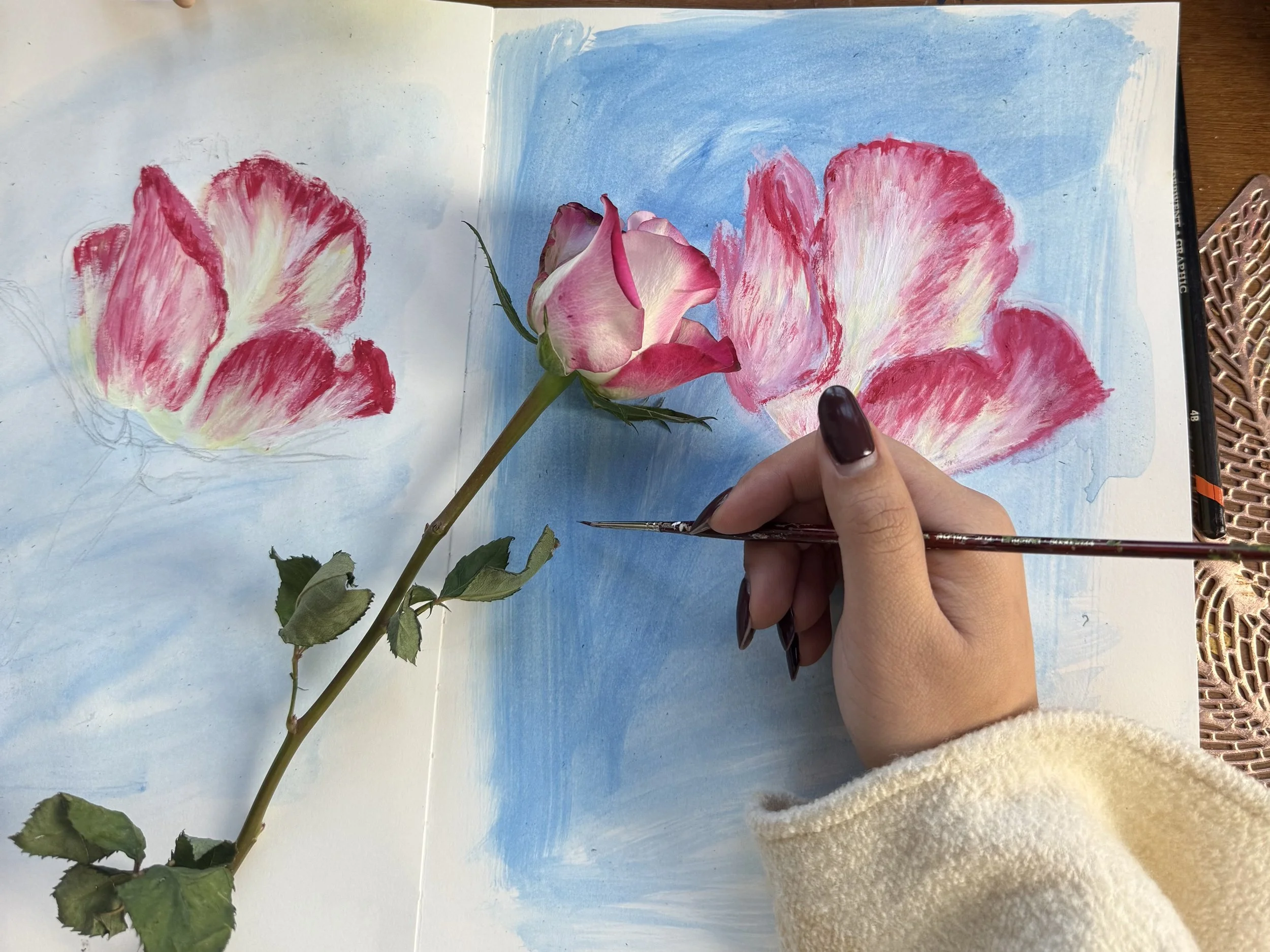
Each series begins with a ritual incorporated into my daily life to quiet the mind. From this point, I begin to ponder which colours communicate the emotions experienced within each ritual.
Composition follows and the vision slowly forms externally. Although nothing is ever fixed, the painting emerges slowly through the play of colour and the rhythm of the paintbrush.
Human Touch 2026
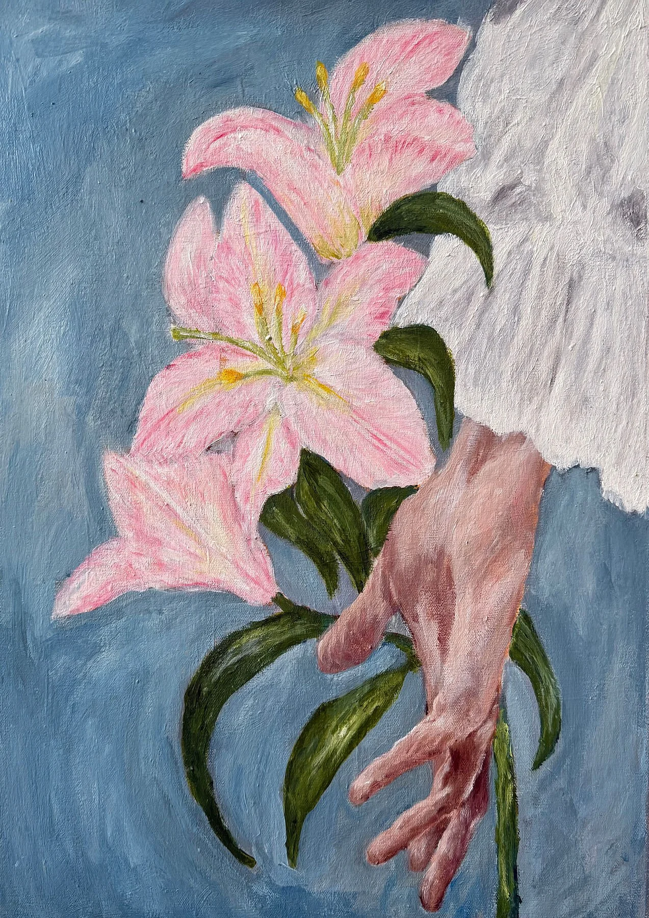
Pink, the Colour of Intricacy
Intricate, layered, and easy to underestimate
My ritual with this series began with noticing my hands. We use them for everything — and yet we rarely stop to look. They carry, create, comfort and communicate from the moment we wake, and still we overlook them entirely.
It was in sitting with that thought that pink kept surfacing. Like the hand itself, pink is rarely what it first appears.
It has dressed aristocracy and challenged governments, carried innocence in one era and rebellion in the next — a colour as layered and nuanced as the 27 bones held inside a human palm.
I chose soft pinks to honour what lives quietly beneath the complex. The painting emerged slowly through the rhythm of the brush — tender and unhurried — asking nothing except that you pause long enough to notice what has always been there
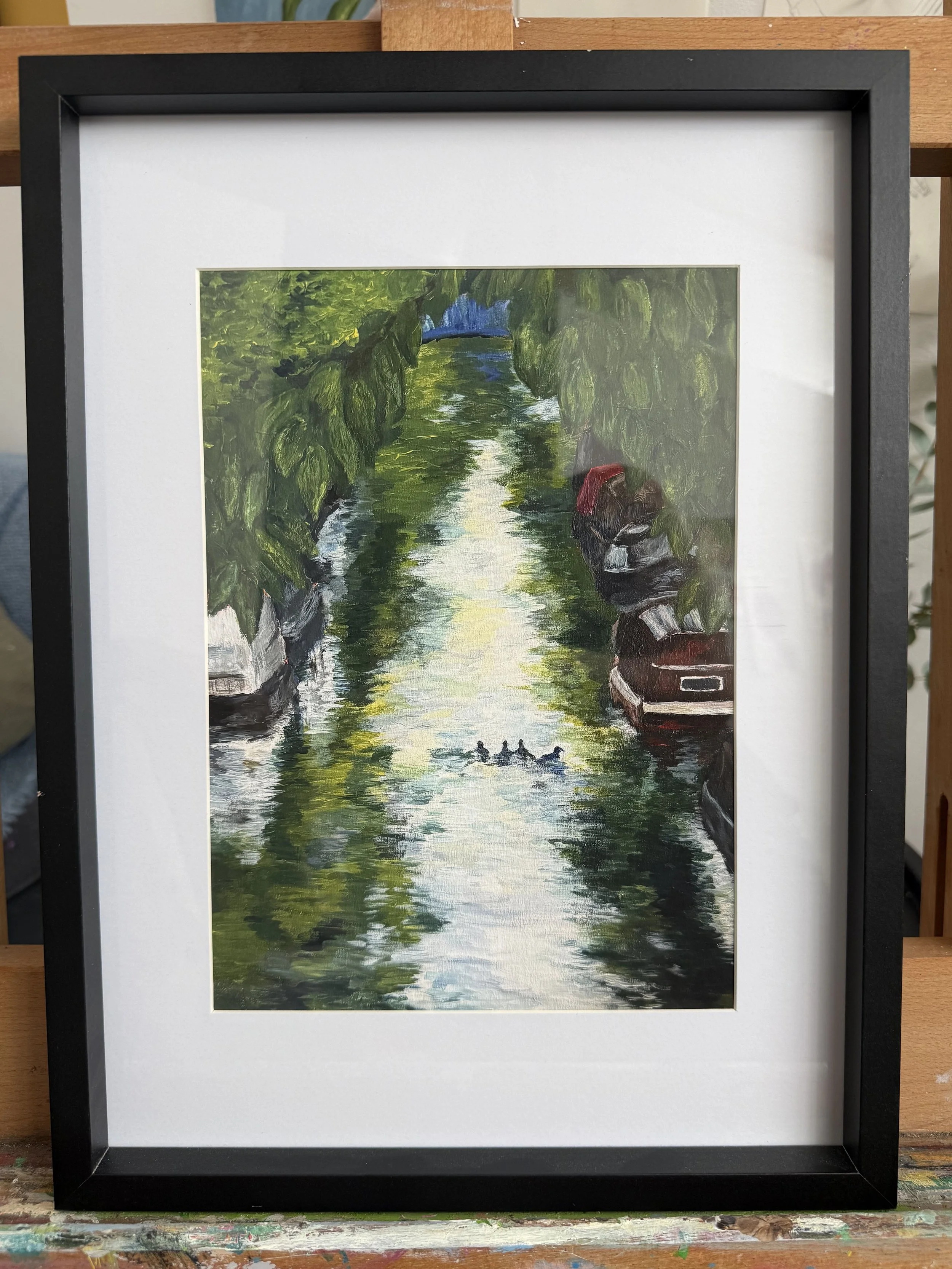
Reflections in Water 2025
Green the Colour of Nature
Harmonious, balanced and easy on the eye
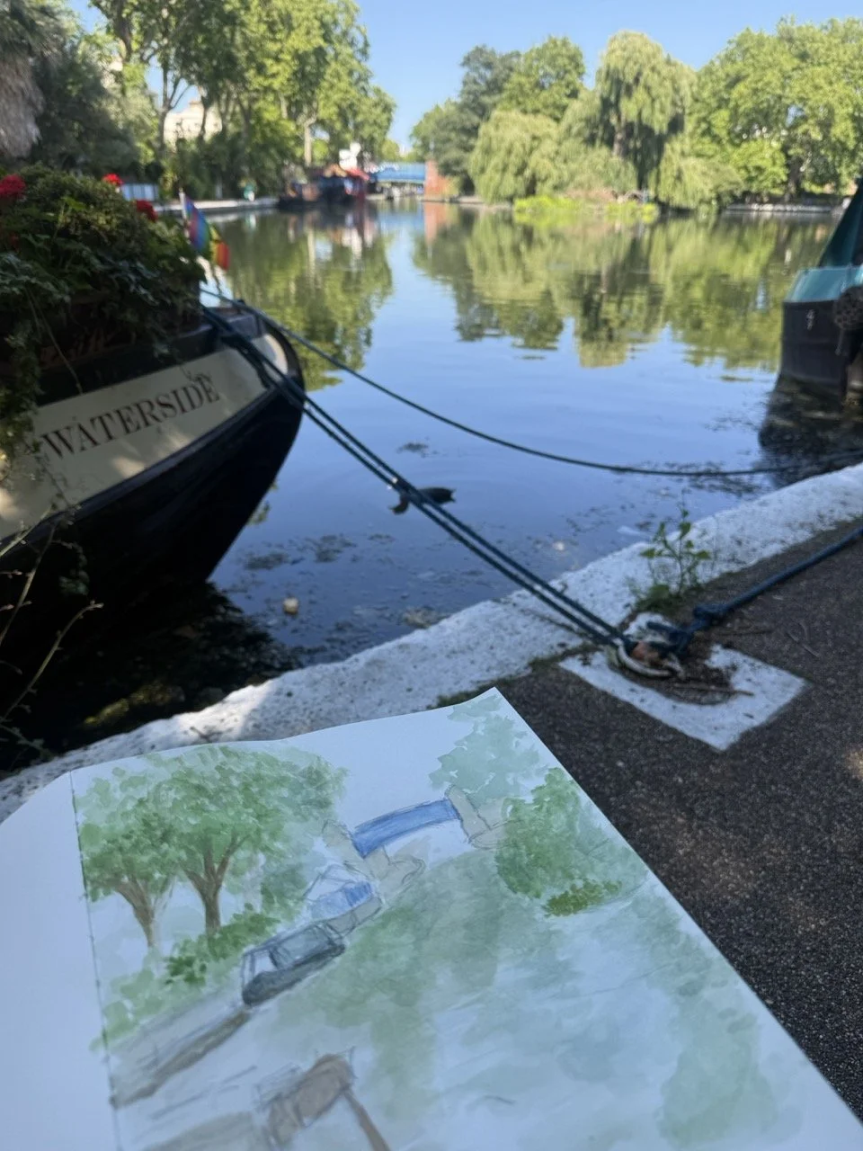
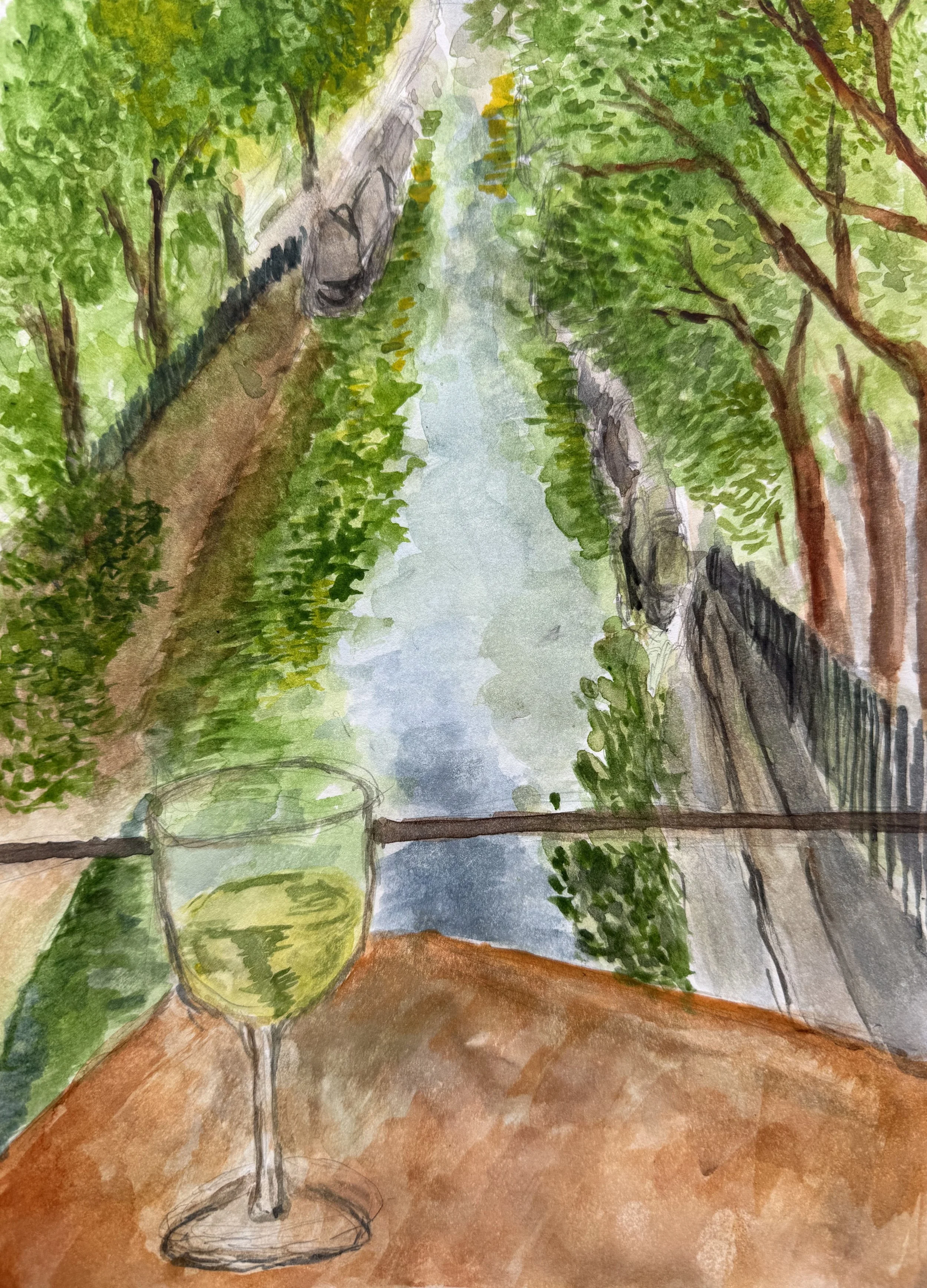
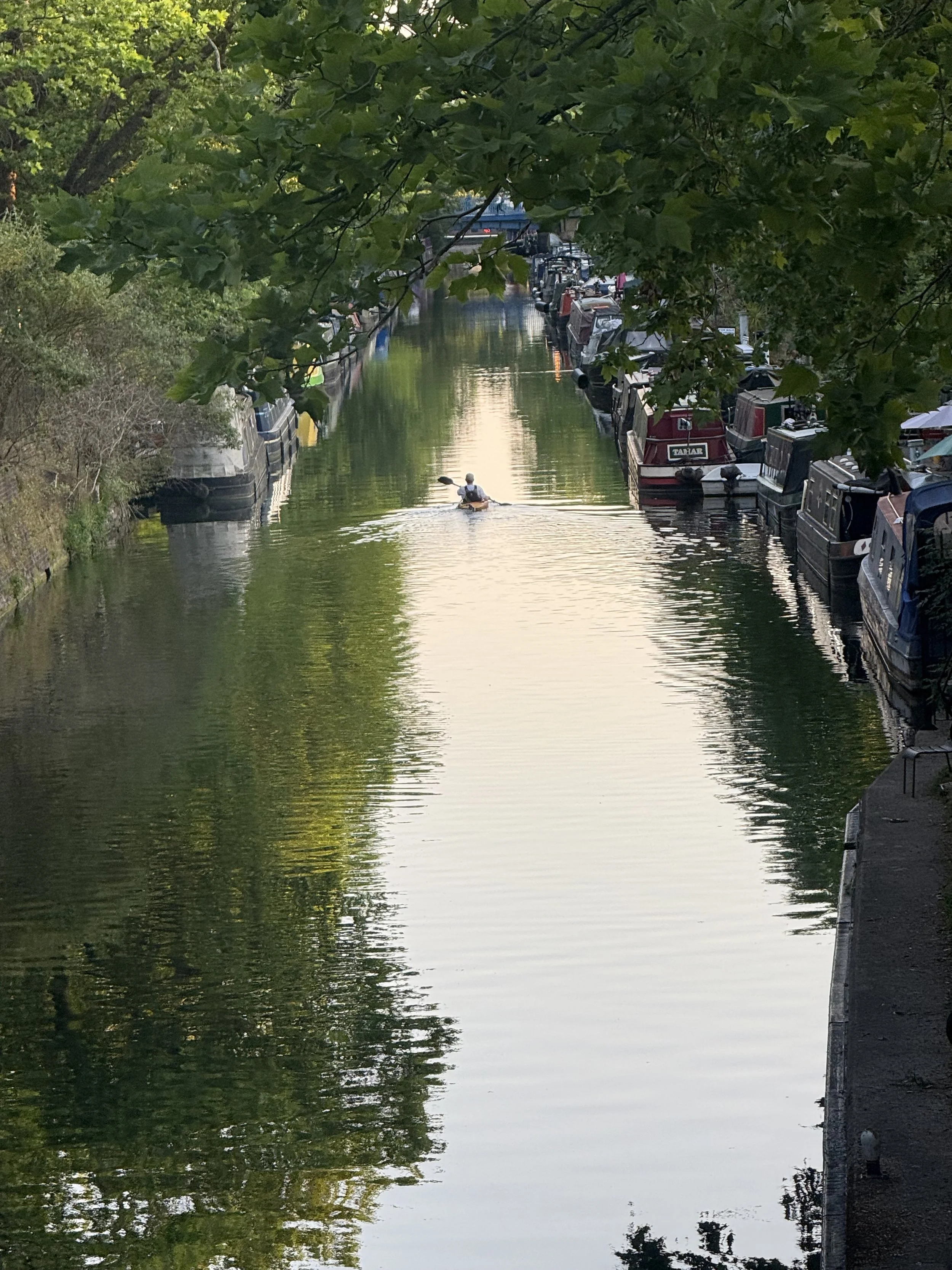
This series began with walking. Specifically, returning to the water's edge in Little Venice, London — a sanctuary tucked quietly into the heart of the city. I would sit and simply watch. The way light moved across the surface.
The way the canopy above dissolved into the water below. The way nothing ever stayed still, and yet the whole scene felt perfectly at rest.
It was through this stillness that green kept revealing itself, not a single green, but many. Alive, shifting, never quite the same twice.
I chose greens that could hold that contradiction — the elusive and the grounded, the shimmer and the shadow. The paintings emerged slowly, each one rooted in a real, observed moment. I studied the scenes in watercolour first, letting the vision form before committing it to canvas
“When we think of green, we almost immediately associate it with nature.
Nature is abundant with green because chlorophyll in plants reflects the green light. Ironically, it is the green light that they cannot absorb,”
Collectable Fine Art Prints
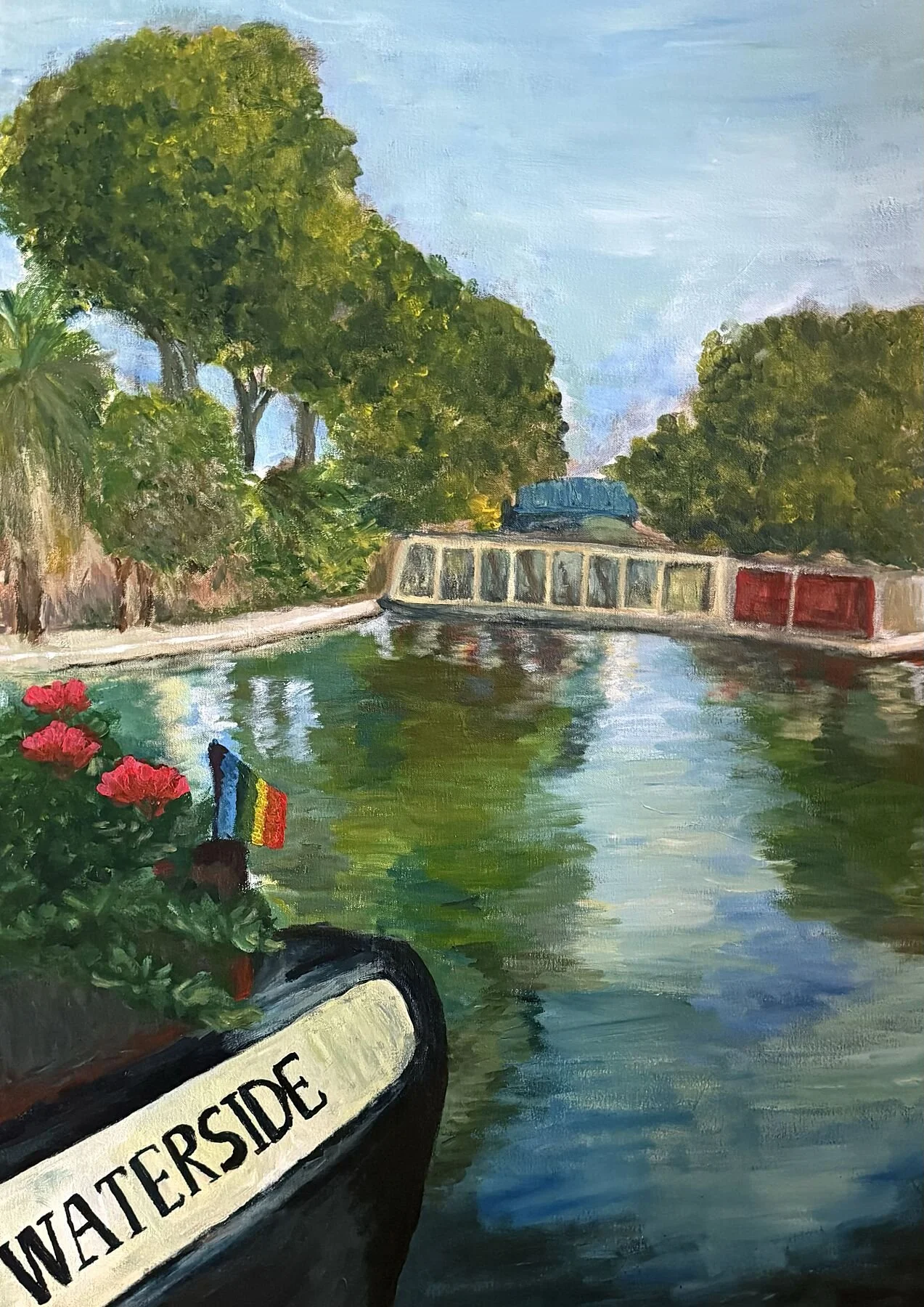
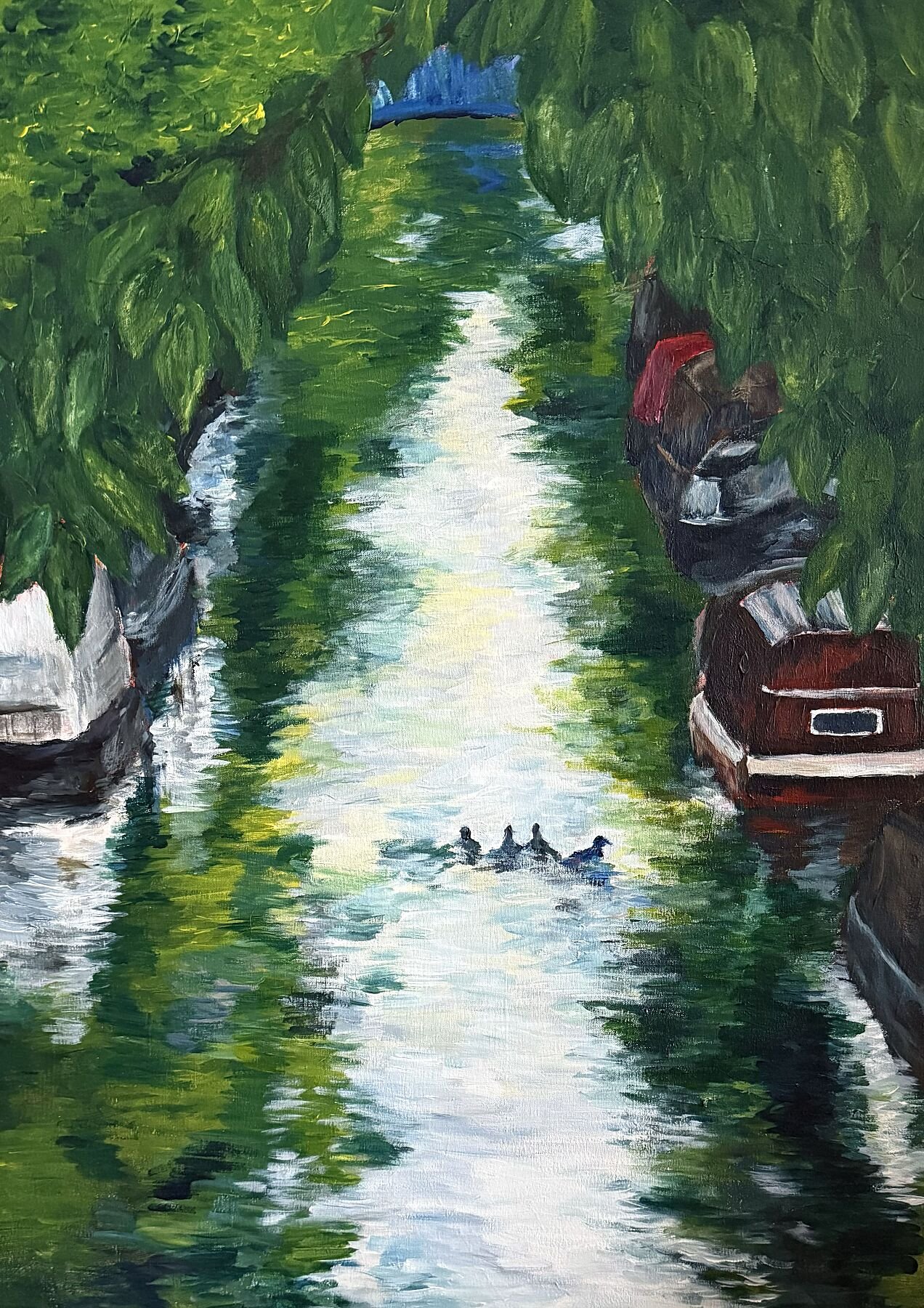
La Ville began with a simple observation in Little Venice, London: water doesn't just reflect, it transforms. Reflections within this painting dissolve the boundary between the solid and the fluid, the observed and the imagined.
The composition is deliberately constructed to pull the viewer in via the narrowing canal into the depth of the scene. So the perspective becomes an invitation, not simply to look at a place, but to step into it and inhabit it.
That openness is intentional.
Each viewer arrives with their own narrative, their own sense of what unfolds beyond the frame. Such specific gives way to the personal, and the painting becomes a shared space between artist and audience.
Signed & Printed in London
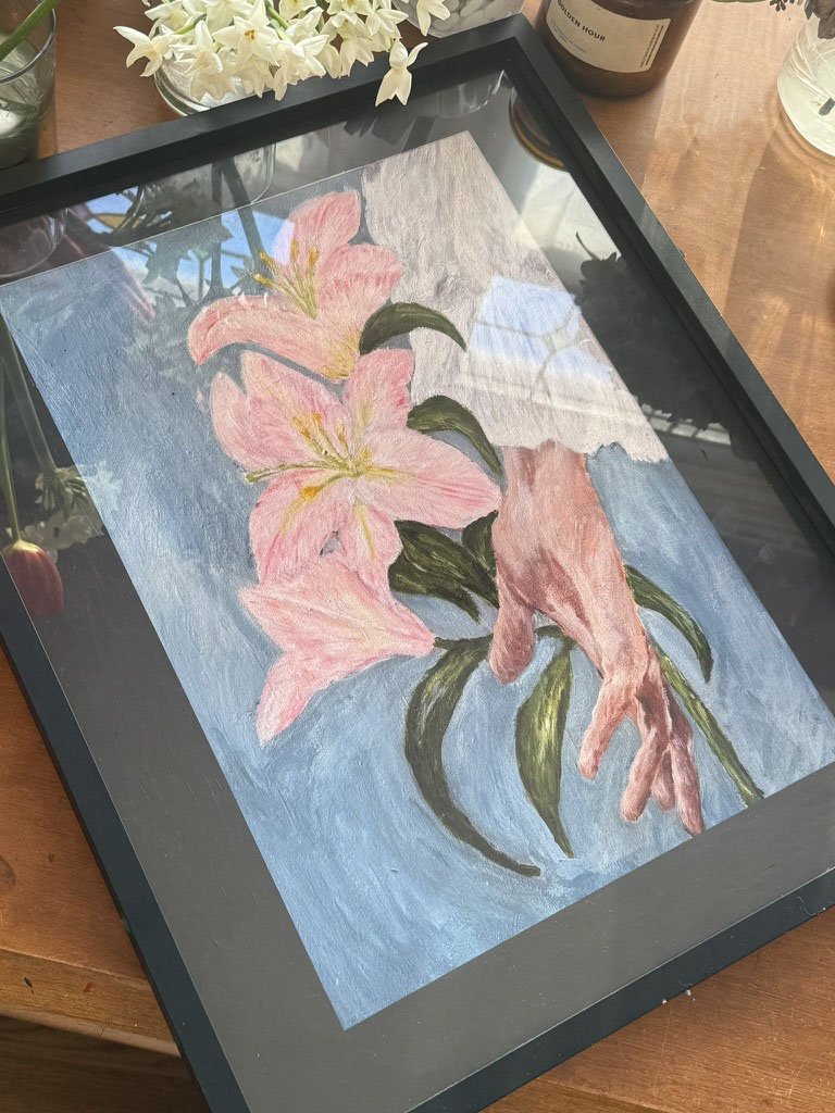
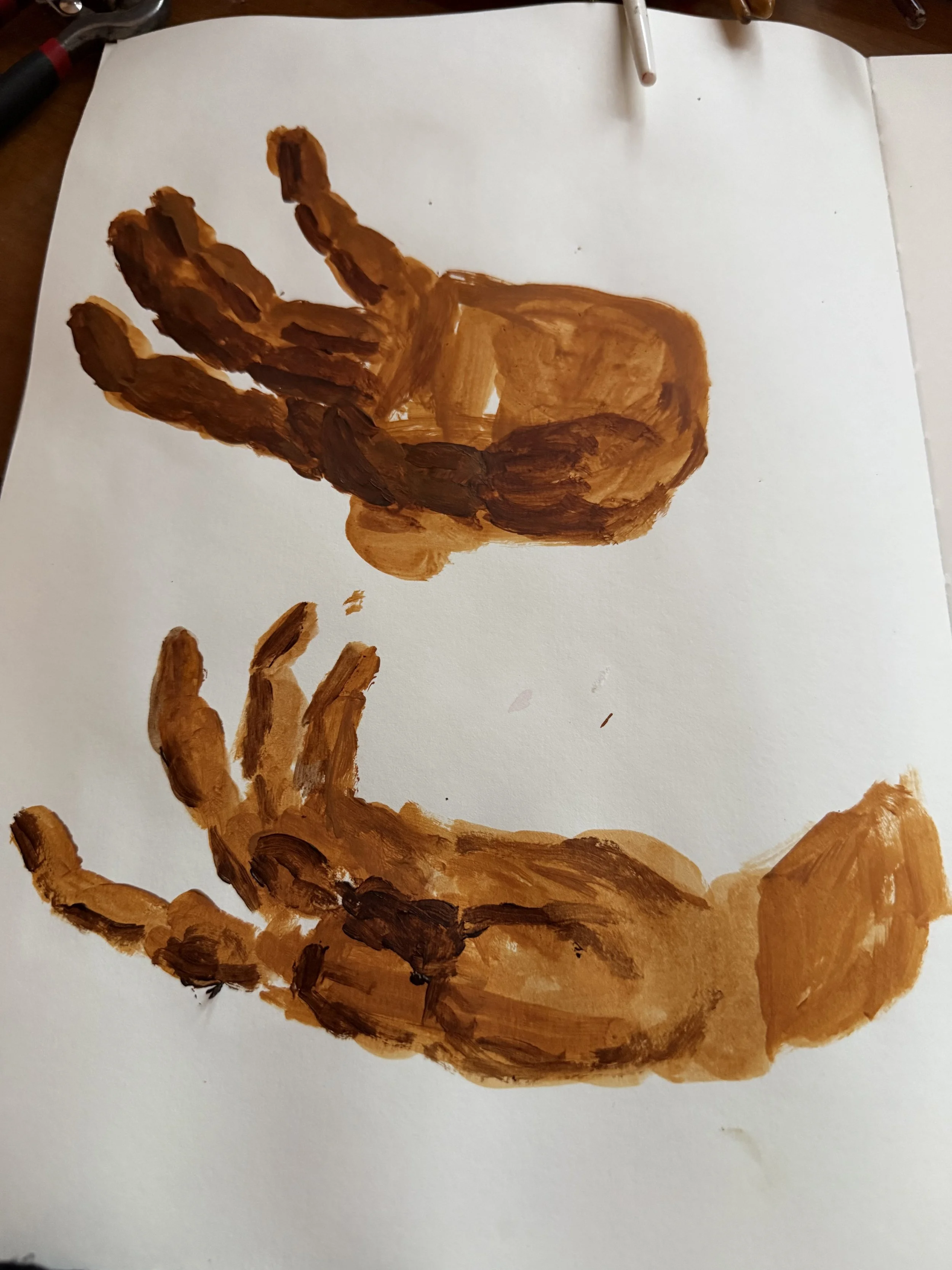
Our hands are simultaneously delicate and complex.
The human hand is made up of a total of 27 individual bones and about one quarter of our body’s bones are found in our hands .
We use our hands for almost everything from carrying heavy items, to gripping pens to write, to gesturing - sometimes rudely, sometimes lovingly.
Softness and strength looks at our ability to feel the tiny sensations through our hands. How these delicate sensory enable us to decipher hot from cold
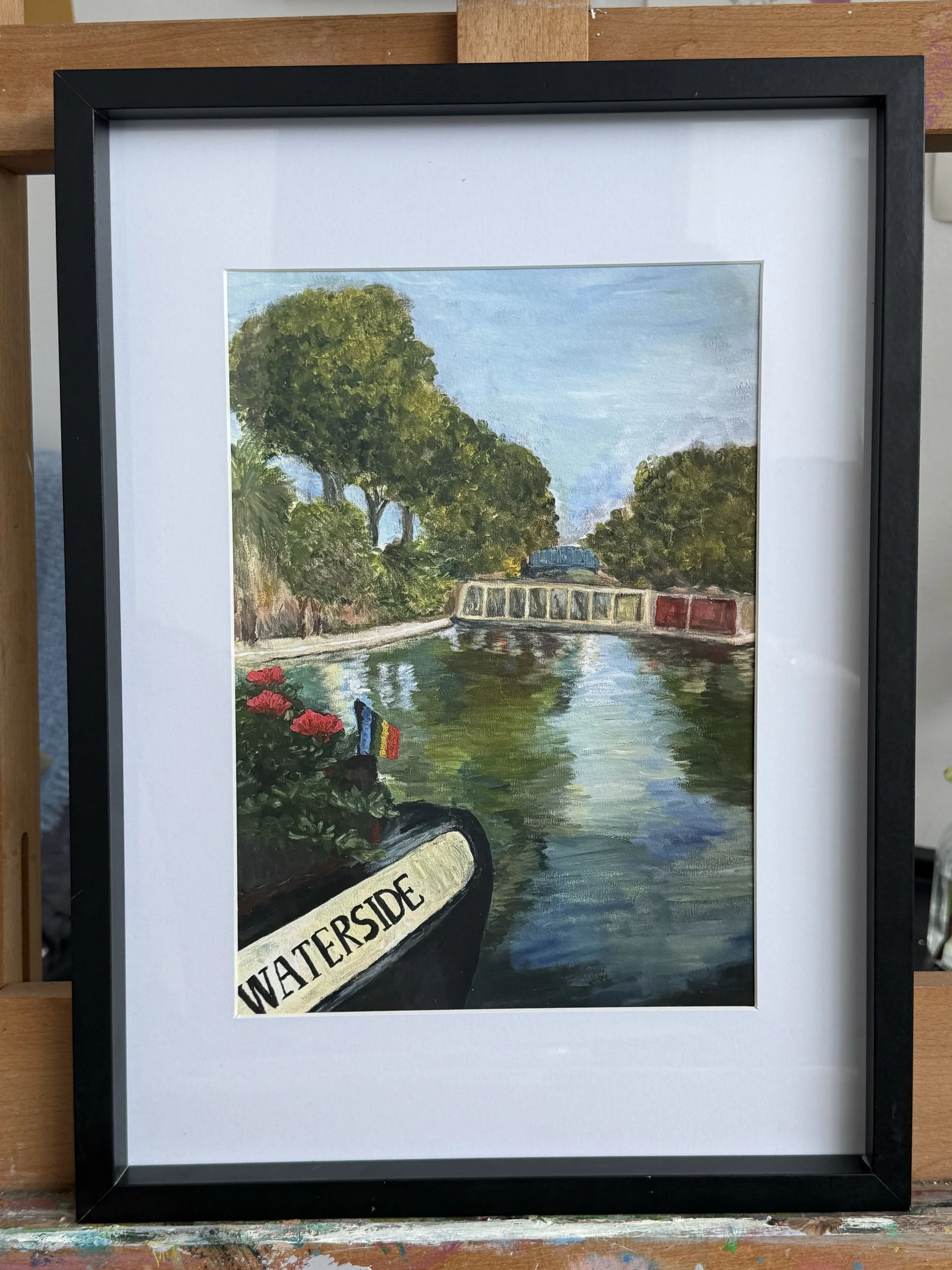
Summer has a colour and it's not one thing. It's blue and green refusing to be separate. In colour psychology, blue and green together create harmony, a natural balance that the eye instinctively relaxes into. Nature figured this out long before we did.
This painting embodies summer. The way the water holds the trees and the trees dissolve back into the water. That specific warmth you only find in July, when everything feels lush and the light lingers longer than it should.
And then there are the boats. An invitation to step in. Climb aboard, untie the rope, go. There is a latent movement here. The geraniums on the bow, the small flag catching air, a sense that this scene is mid-breath rather than frozen. The canal doesn't feel like a photograph. It feels like a place you could inhabit.