
Harmonious, Balanced and Easy on the Eye
This series began with walking.
Not walking with a destination, or walking for exercise, but the kind of walking that is really just another word for looking. It began, if I'm honest, with a hot summer day and a dog who needed shade.
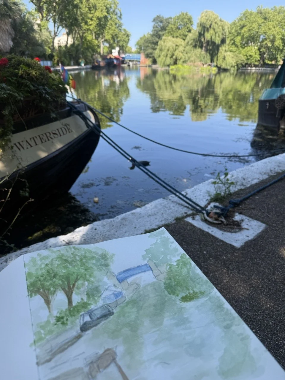
Anping does not do well in the heat. Neither do I. So on one particularly relentless afternoon, I found myself looking for somewhere cool and sheltered — somewhere the city felt less like a city. A friend mentioned Little Venice. I had been before, but not slowly, not with the intention of simply being there. That afternoon changed that.
We arrived at the water's edge and the temperature dropped immediately. The tree canopy closed overhead, the light softened, and Anping — who had been dragging her paws on the pavement — settled into the shade and exhaled. I did the same.
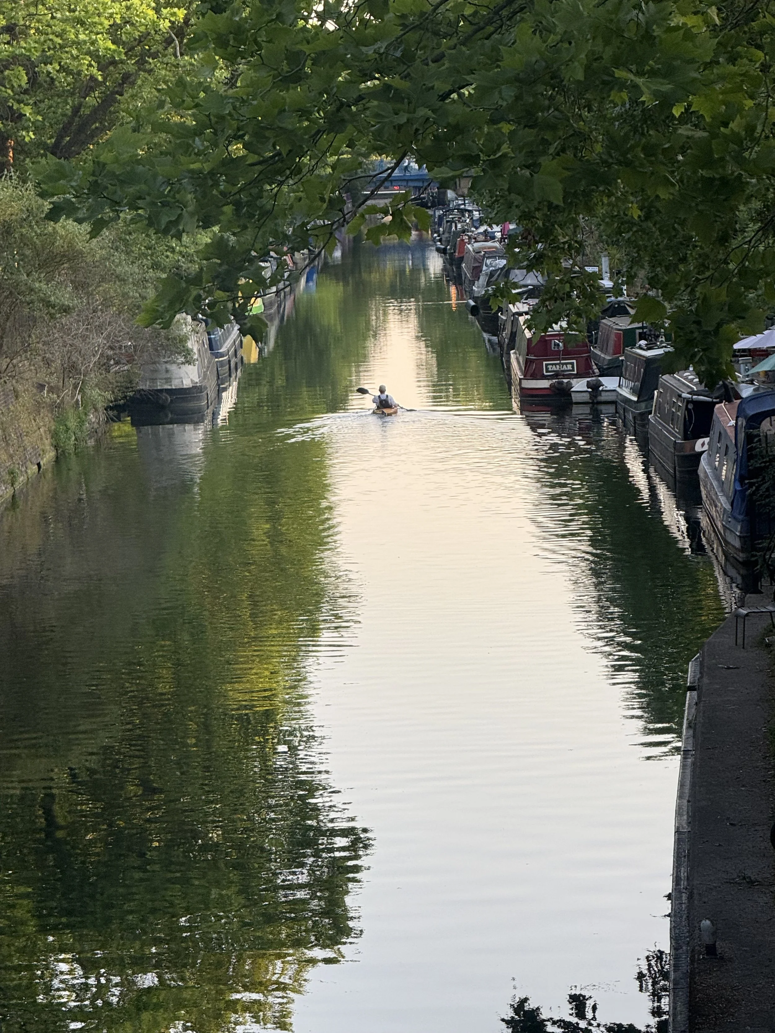
I would return again and again after that. Not always with a sketchbook. Often just with Anping, finding the same quiet corner, sitting and watching. The water in Little Venice doesn't perform. It doesn't dazzle the way the sea does, or rush the way a river does. It does something quieter and, I think, more interesting — it reflects. The canopy of trees above dissolves into the surface below, so that at certain moments you can't be entirely sure where the real world ends and its mirror begins. Light moves across it in ways that are almost imperceptible until suddenly they aren't. Nothing ever stays still, and yet the whole scene holds itself with a kind of perfect composure.
I kept coming back because I couldn't quite catch it.
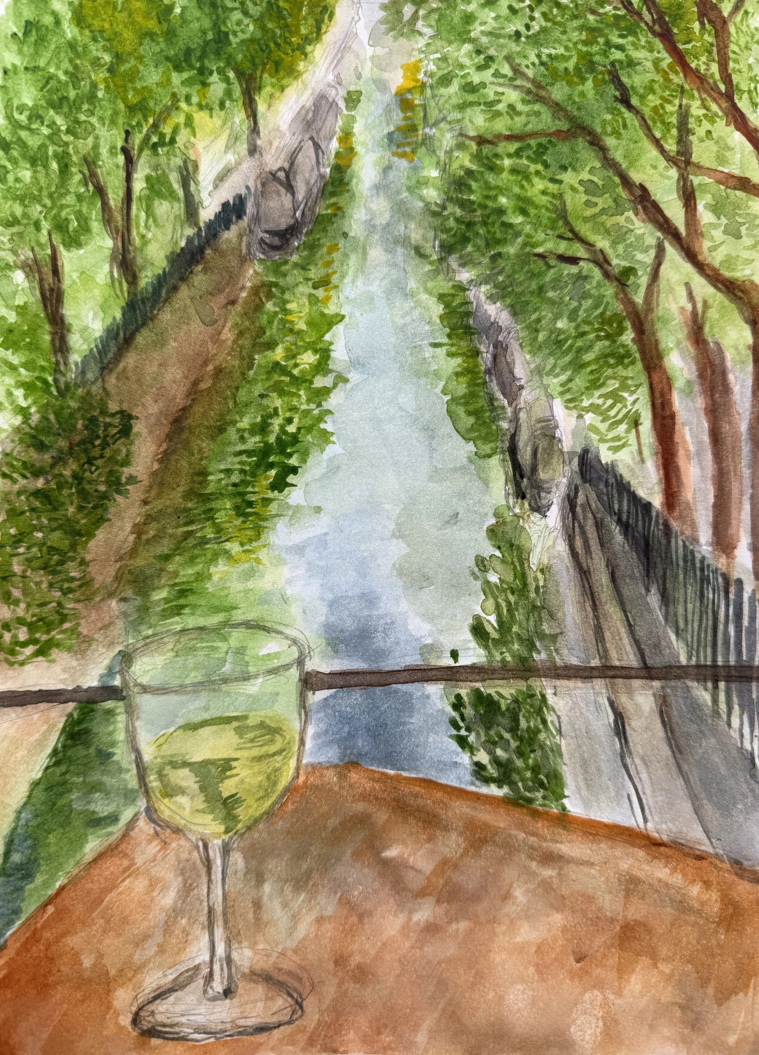
It was through this stillness that green began to reveal itself to me — not as a colour, but as a conversation. There is no single green in Little Venice. There is the bright, almost electric green of new leaves in full sun. There is the deep, shadowed green of water beneath a heavy canopy. There is the grey-green of a surface just before the light shifts, and the golden green of the moment just after. They contradict each other and yet somehow agree, the way a well-composed painting does — each element distinct, the whole thing harmonious.
Choosing the right greens for this series was not a technical decision. It was an act of listening. I was looking for colours that could hold that contradiction — the elusive and the grounded, the shimmer and the shadow — without collapsing into each other or pulling apart. Greens that could suggest movement while remaining perfectly still on the canvas.
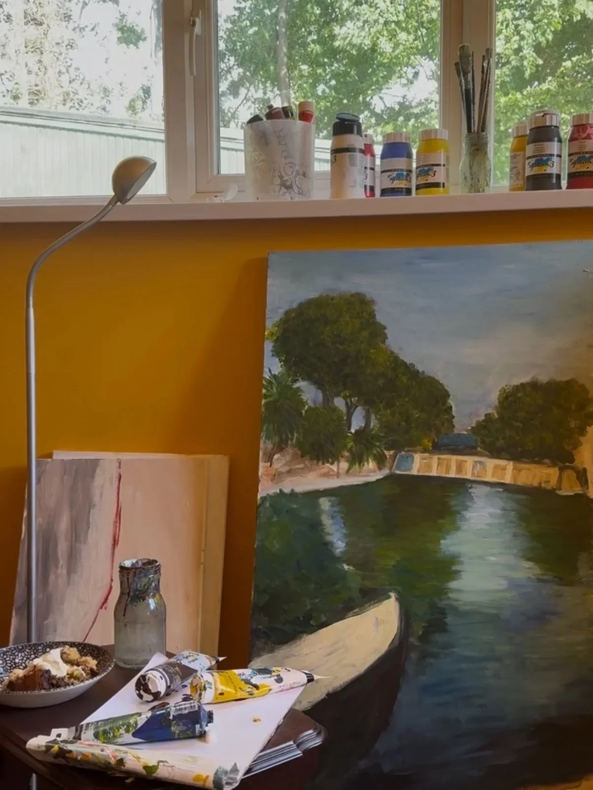
I began, as I always do, in watercolour. There is something about the way watercolour behaves that suits the early stages of seeing — it is transparent, responsive, almost reluctant to be definitive. Working in watercolour first allowed me to study each scene without committing to it, to let the vision form at its own pace. Some scenes I returned to many times before I understood what the painting was really about.
Only then did I move to canvas.
The paintings in this series are each rooted in a real, observed moment — a specific afternoon, a particular quality of light, a reflection I watched long enough to almost memorise. But they are not records. They are responses. My attempt to hold something that was never meant to be held, and to offer it — calmly, without fuss — to whoever wants to carry a little of that stillness with them.
It started with a hot day and a dog looking for shade. It became something I couldn't stop returning to.
Harmonious. Balanced. Easy on the eye.
Not because the world always is, but because sometimes, if you sit quietly by the water long enough — with a dog asleep beside you — it becomes so.
This series is inspired by Monet, the master of colour and light. It captures the interactions between light and colour in summer.
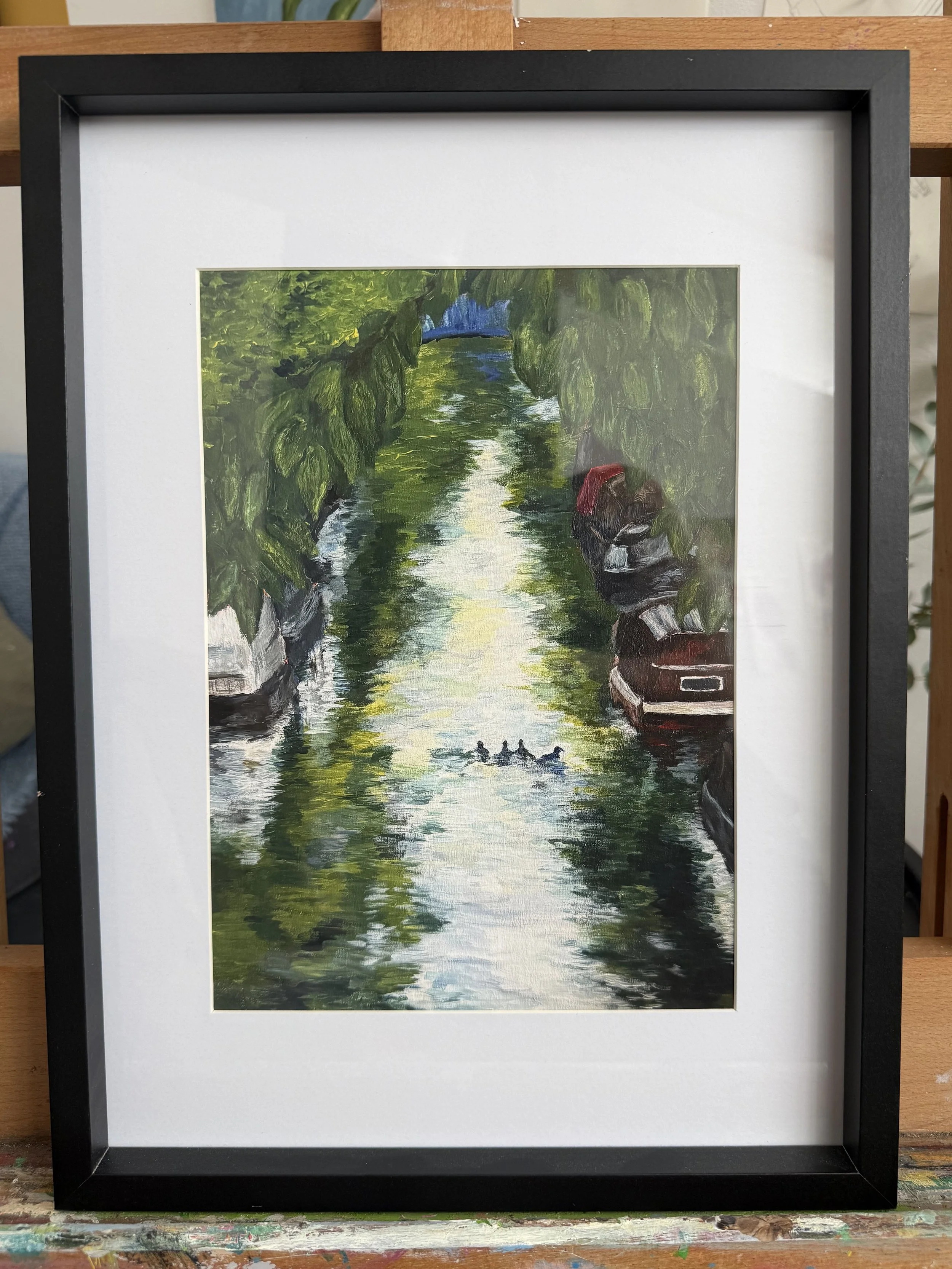
Summer sunlight transforms the green spaces of London into a serene haven. This sanctuary, nestled in Little Venice above the Regent's Canal, is enclosed by a canopy of trees whose greens and blues shimmer in the glistening water below.
I have deliberately constructed the composition to draw the viewer in along the narrowing canal, deeper into the scene. The perspective becomes an invitation — not simply to look, but to step in and inhabit. In this way, the story is co-created between artist and audience.
This series is inspired by Monet, the master of colour and light, capturing the interplay between light and colour across the height of summer.
At high noon, summer colours shine with brilliant intensity. The array of blues and greens never compete, but shimmer harmoniously within the water — dissolving into one another in a perpetual, gentle flux.
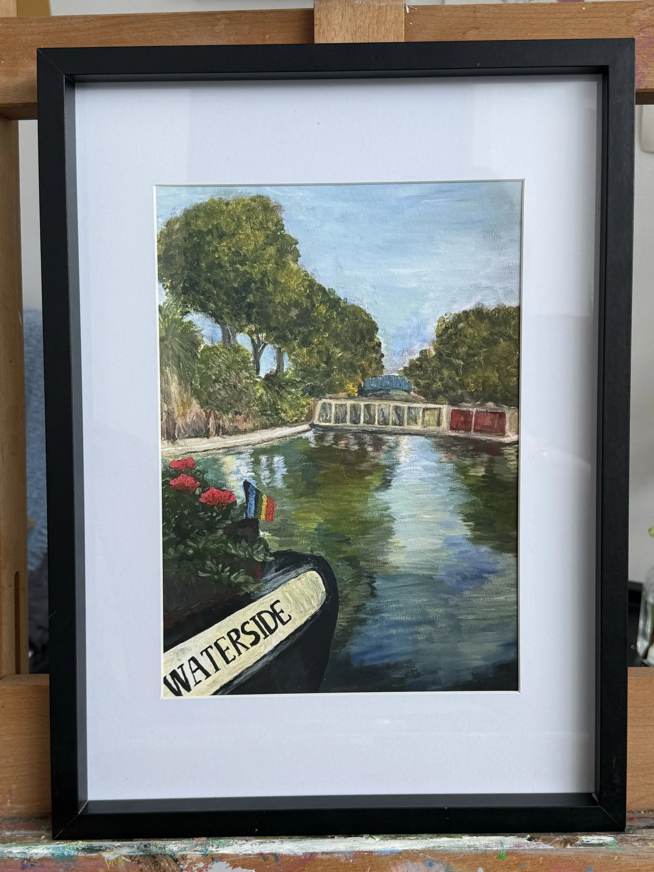
The trees are alive with lush green, swaying softly in the warm breeze. I wanted the blues and greens, accented with touches of brown, to draw from John Constable — an ode to the English countryside, awash with these bright hues beneath the summer sun.